SOFTWARE DEVELOPMENT
Clean Application — Flexible Box Layout
The Holy Grail, in simple words, is a web page layout with multiple, columns having same heights and are specified with styling sheets.
- Read time
- 3 min read
- Word count
- 746 words
- Date
- Apr 7, 2020
🌟 Non-members read here
About 4 years ago, I had the idea to create a tutorial on how to build clean, lightweight, and extremely fast web applications without any fast-food frameworks, which leads us to save the environment by reducing energy consumption by the web servers and the clients’ computers and devices.
This tutorial is still in progress, but now I have the time to publish these articles one by one. So, let’s start with the main application layout without any Bootstrap, Foundation, or Material UI.
Holy Grail Layout
The Holy Grail, in simple words, is a web page layout with multiple, columns having the same heights and are specified with styling sheets. Although it has always been preferred to be used by developers but for many years the methods of implementation using the existing technologies had numerous drawbacks. As a result, the need to explore and determine an optimal implementation methodology leads to the adoption of Holy Grail.
+---------------------------------+
|           HEADER AREA           |
+-------+-----------------+-------+
|       |                 |       |
|       |                 |       |
|SIDEBAR|     CONTENT     |SIDEBAR|
|       |                 |       |
|       |                 |       |
+-------+-----------------+-------+
|           FOOTER AREA           |
+---------------------------------+
Web standards recently have incorporated further end-to-end and robust solutions in order to execute the layout shown above. Particularly the CSS Flexible Box Layout and CSS Grid Layout modules are available with their complete solutions.
Creating Flexible Box Layout
To keep things simple, we’ll use Flexible Box Layout instead of Grid Layout since Internet Explorer 10+ is backward compatible. Therefore the directory structure will be as follows:
01-layout
├── styles
│   ├── flex.css
│   └── theme.css
└── index.html
So consider creating an index.html page of the following structure:
<body>
  <header>Header</header>
  <div id="main">
    <article>Content</article>
    <aside>Left sidebar</aside>
    <aside>Right sidebar</aside>
  </div>
  <footer>Footer</footer>
</body>
Important Note: It’s crucial to add DOCTYPE, html, and head sections to the index.html page.
If this page is opened in the browser, the texts will appear in rows. If they do, we can consider this behavior accurate for block-level elements which will be useful in designing layouts for mobile devices.
Next, we create a folder for styles and a file named flex.css:
* {
  box-sizing: border-box;
  margin: 0;
  padding: 0;
}

body {
  display: flex;
  flex-direction: column;
  min-height: 100vh;
}

#main,
#main > article {
  flex: 1;
}

@media only screen and (min-width: 768px) {
  #main {
    display: flex;
  }

  #main > aside {
    flex: 0 0 20%;
  }

  #main > aside:first-of-type {
    order: -1;
  }
}
Detailed Explanation
Firstly, we reset all the indents (margin, padding, border-box) for all the available elements. The border-box tells the browser to account for any border and padding in the values we specify for any elements i.e. width and/or height.
Secondly, two things are set:
flex-related properties to the body,#mainandarticlewhich allow us to resize our layout to full screen, andmin-heightto100vhforbodyelements wherevhsignifies the percentage of height of the viewport.
Checkout viewport percentage lengths for further information.
From now on, the rules apply only for screens greater than or equal to 768 pixels. Therefore, considering the current screen to be large enough, let’s start building the layout with three columns:
The first step is to display #main as flex box model. The second step is to set our sidebars width to 20%. Finally, we move the first sidebar to the left end of the page.
Now, we link this flex.css file to our index.html page to the <head> section in the following way:
<link href="./styles/flex.css" rel="stylesheet" />
Appearance Enhancement
For the purpose of improving our presentation, we can add few paddings to the flex.css file as shown below:
aside,
footer,
header,
#main > article {
  padding: 1em;
}
We create theme.css file using the following content:
body {
  background-color: White;
  color: DarkSlateGray;
}
header,
footer {
  background-color: Indigo;
  color: White;
}
#main > aside {
  background-color: LightCyan;
}
Once done, link this file to the index.html page to the <head> section:
<link href="./styles/theme.css" rel="stylesheet" />
Note: Don’t worry about linking multiple styles at this time. We will “bundle” them in the future articles.
Additionally, we can add some text contents like Lorem ipsum for a better presentation.
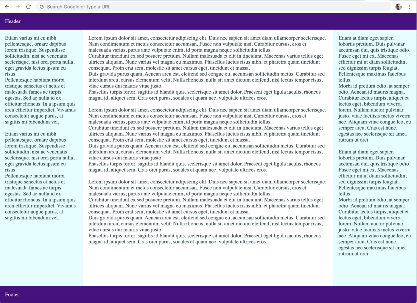
Testing the Result
We’re now ready to open index.html page using our browser, and it should appear as below:
That’s pretty much it for now, follow me to not miss the next part of this tutorial.
In the next tutorial we will discuss CSS block positions and how to manipulate different positions of an element.